Study: Fall Lake by Rick Surowicz

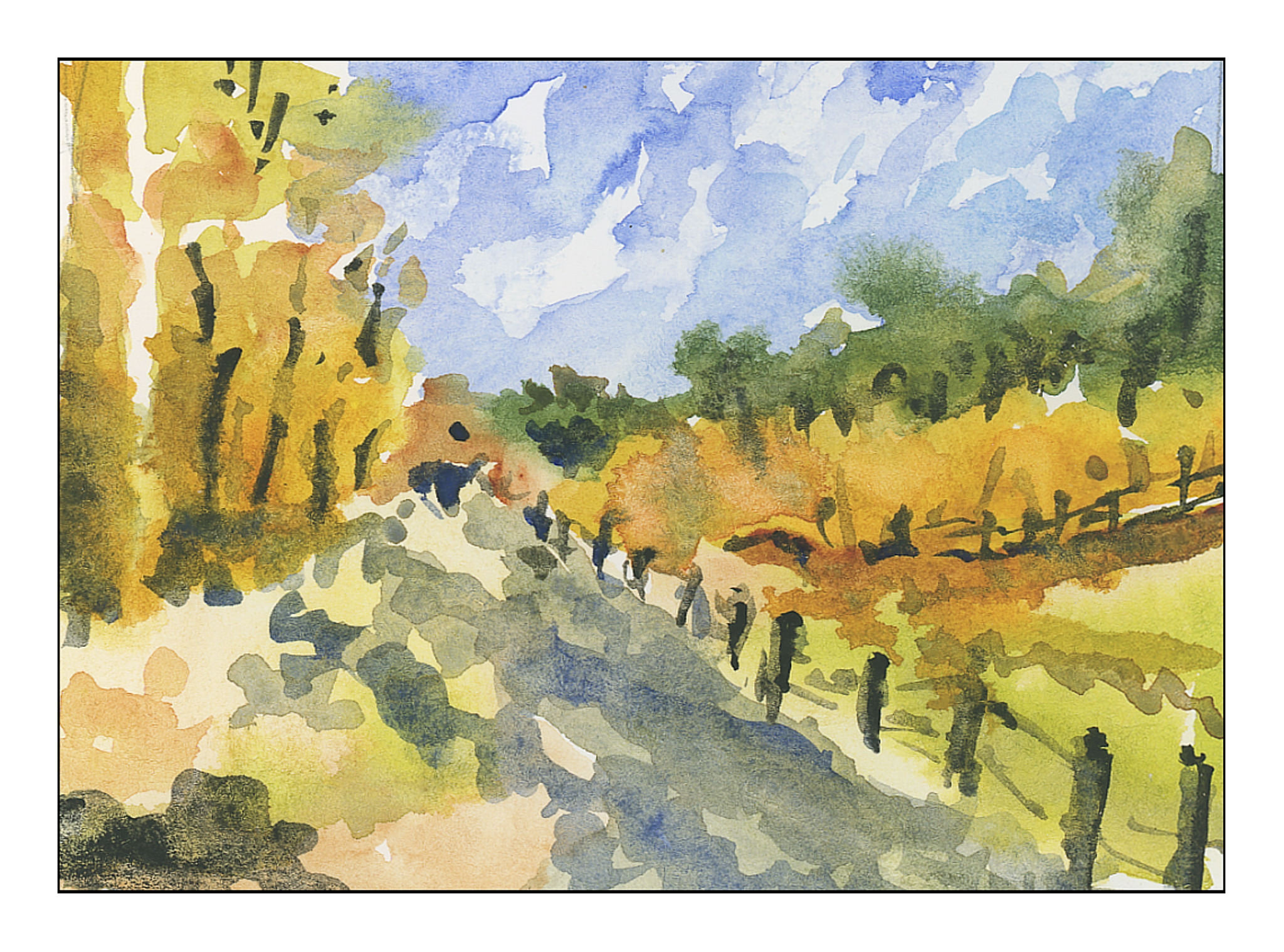
Rick Surowicz has taken YouTube by storm, gaining a strong following of over 25K subscribers.  Pretty sweet deal considering he put his first video out in late May 2017.  This shows you Rick’s appeal.  His first videos were really good, but his later ones have continued to improve.  Frequently he does two videos – one is a very teacherly, with clear explanations of why he does this or that, what his thought process is, and the colors and brushes he chooses.  A second one is speeded up 2 or 3 times.  This allows the viewer to preview his longer version, seeing what is up ahead before diving into the longer, detailed video.

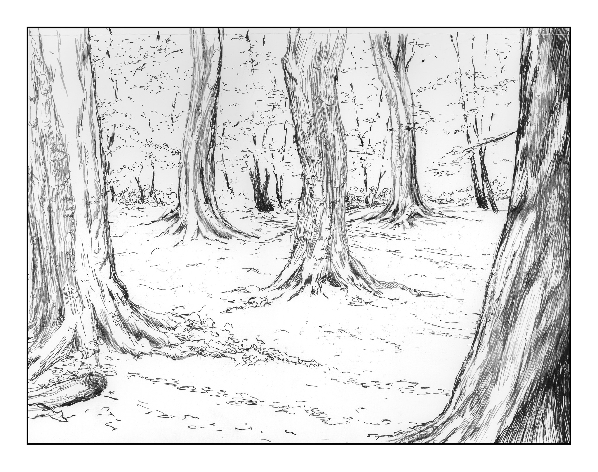
This is my 4th or 5th follow-along with Rick.  Given my more recent issues with representation of detail, not each busy detail, I thought I would do one of his studies today.  (I also am tired of sewing!)  Rick’s video is about 45 minutes long; this took me about 2.5 hours with stopping and starting the show.  It’s a great way to practice different techniques.

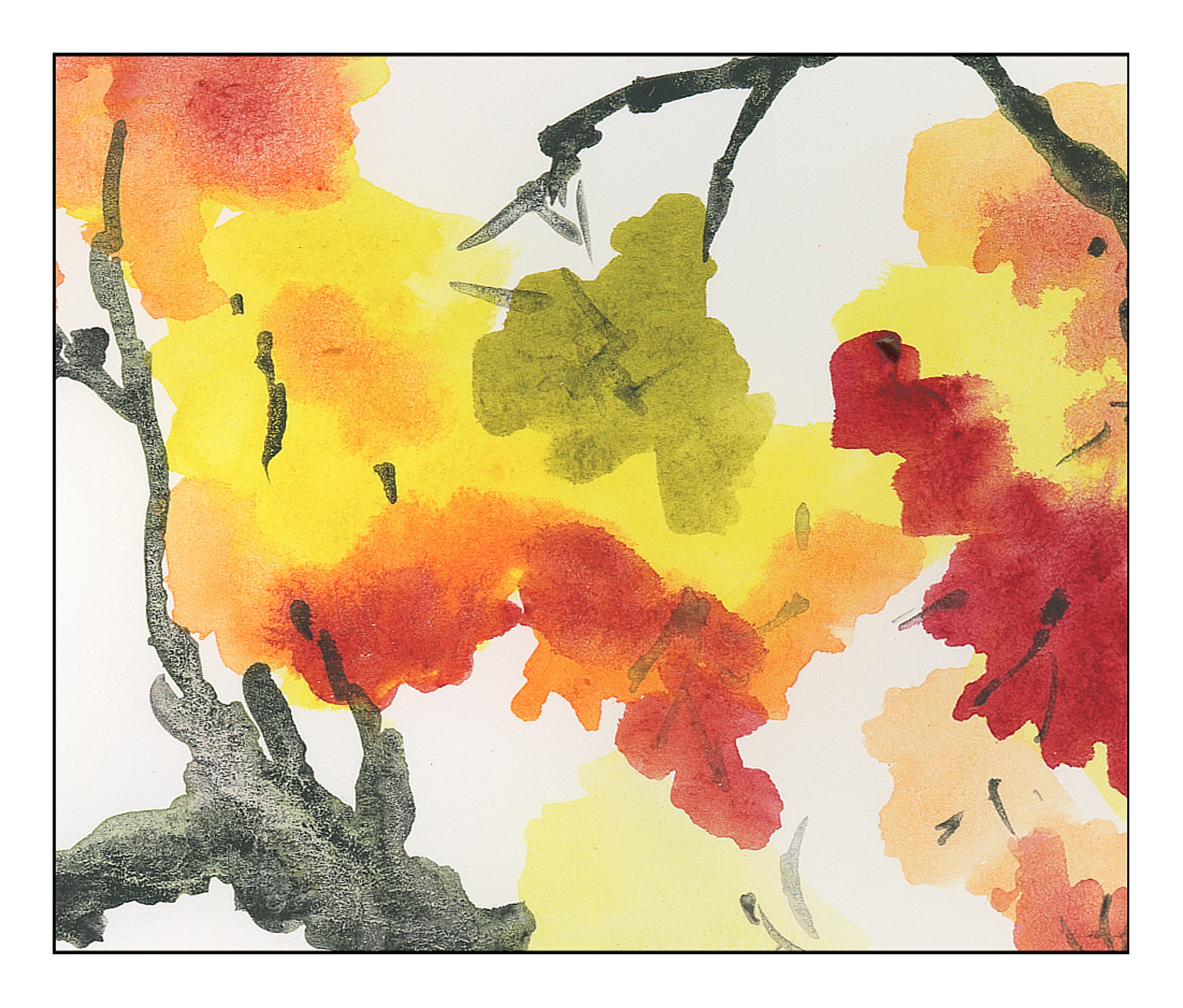
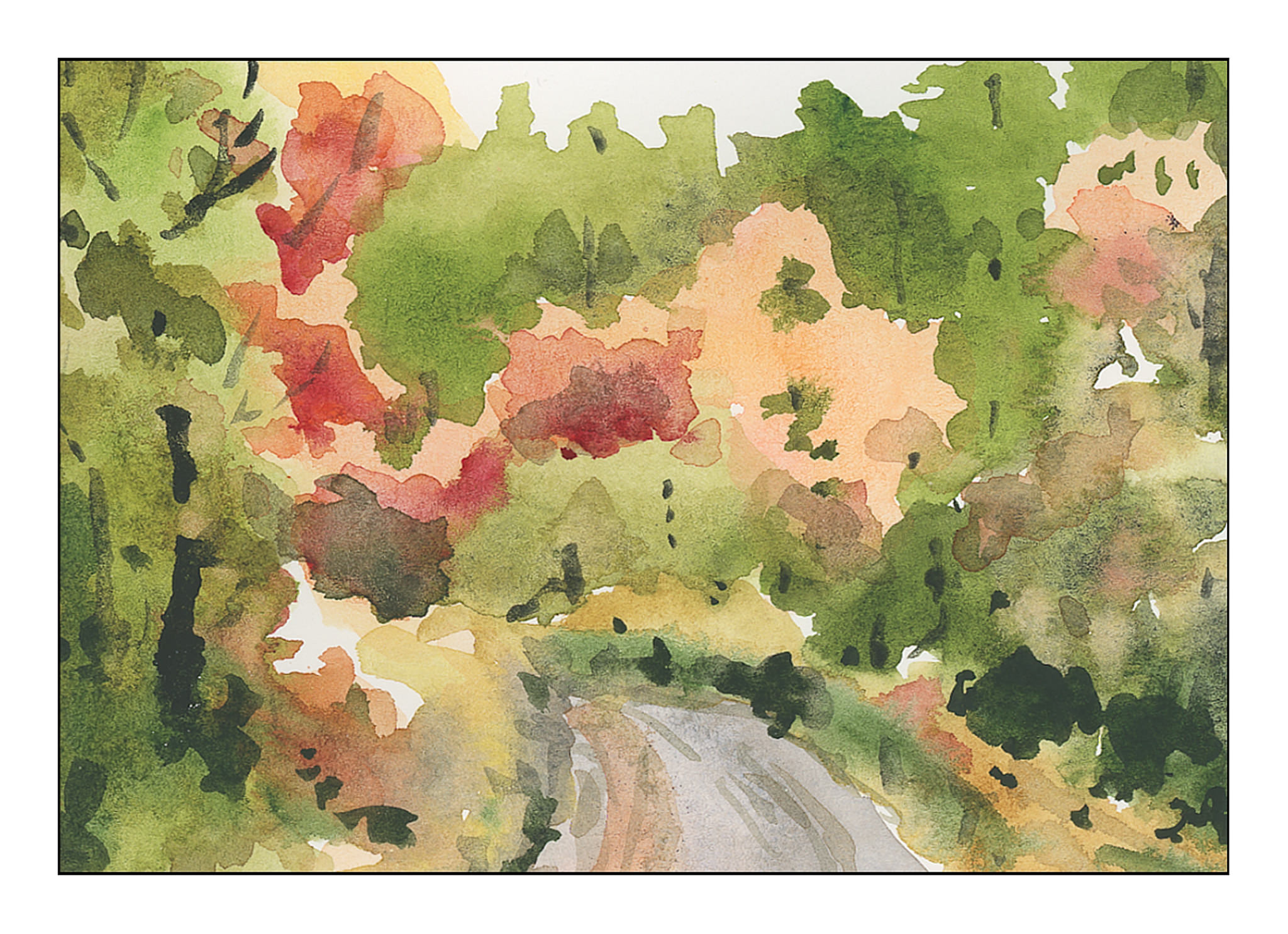
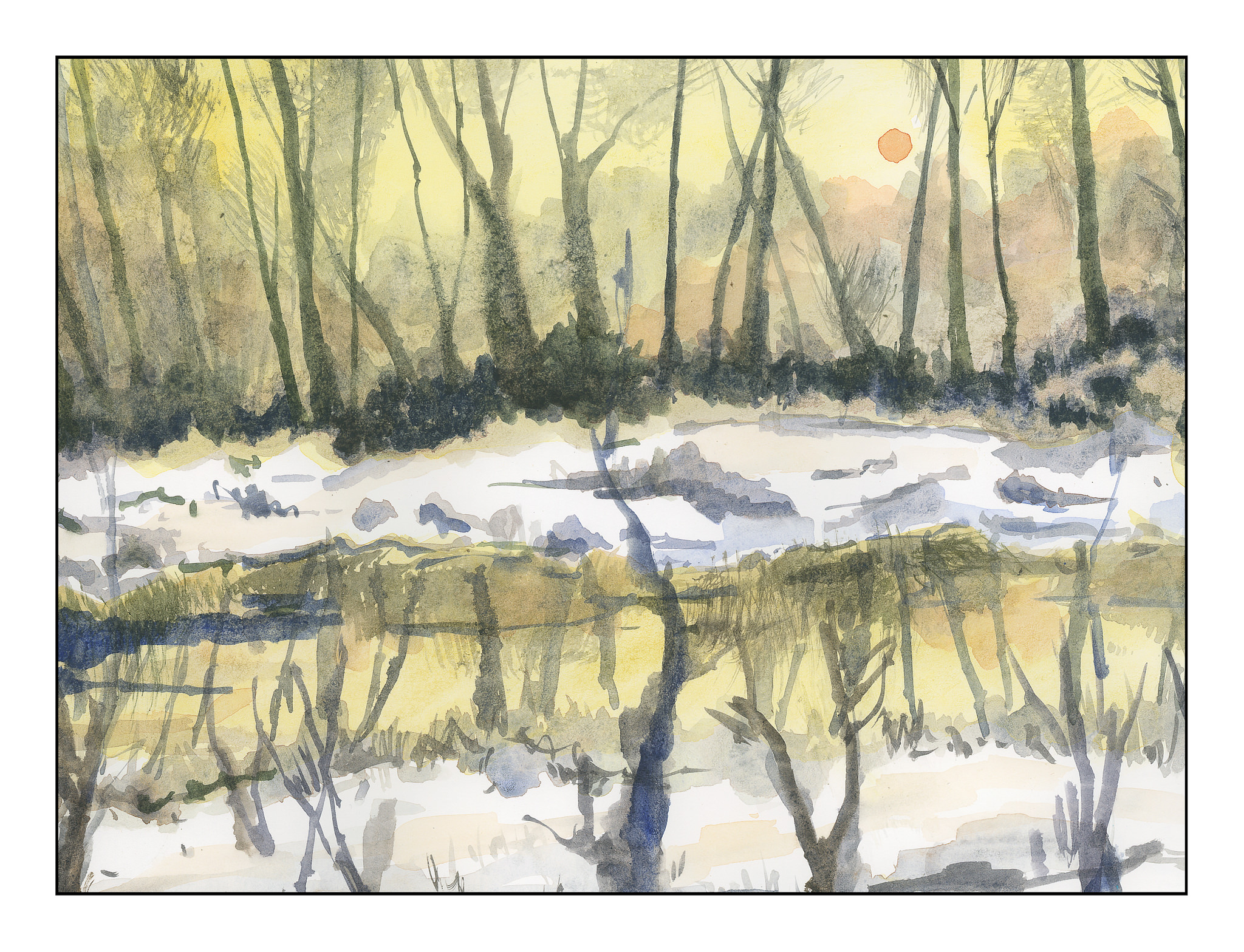
There are a lot of really great instructional videos on YouTube – you can – and I have – learn so much.  Right now, though, I have what I consider to be a serious problem:  what is my style?  Copying a masterful painter gives one skills, but the interpretation has to be personal.  I figure I am on the way there – it will sort of happen – but one thing I do know, I do not want to create chaotic paintings without good contrast, clean color, and strong composition.  Rick’s paintings have all three and make for good lessons.  They are very different than the detailed fruits and flowers of Anna Mason, but those very detailed paintings also teach things such as texture, detail, light and dark.  I have learned from those as well.


Simplified Details

Anyone who does watercolor or painting or drawing is well aware of the need to simplify details, especially in masses of color.  Every leaf does not need to be painted.  When we look, we see these details, and the effort to simplify them into areas of light and dark and midtones can be – and often is – very challenging.  Good artists make it look so easy!

The other day I was napping on the patio (I live in a warm part of the world).  When I woke up, I looked at the podocarpus trees along the back wall, and suddenly got the idea.  I saw the details of the leaves – each leaf – but I also saw the light and the dark areas.  That is when I realized I could do it – but it had never been in the front of my mind before.

I went to work.  No outlines by pencil, just some reference photos labeled “foliage” in a search.  Varied pictures showed up, and here are my studies of simplified details.

These first three are thumbnails, about 3×4 inches in the order I painted them.

I did the above paintings yesterday.  This morning, applying the same tactic of no lines drawn, I used a 9×12 inch sheet of paper and painted out to the edges.  Again, the focus is on simplification of details into masses of color.

Success?  I don’t think any of the paintings are particularly good, but I do think I am getting that element of simplification I find so elusive in my own painting.

Inktober #31: Slice

Okay!  Today is Halloween, a day of gore and horror.  Inktober is not making this a “safe” subject for today, either – SLICE!  Really?  You can get pretty gruesome with that one.

So, with a hail to famous or infamous quotes, a slur on red velvet cake (which I dislike intensely), I bring you a slice of history, a slice of cake, a slice of the macabre, a slice of my own sick sense of humor, and best wishes for a fun and scary Halloween.