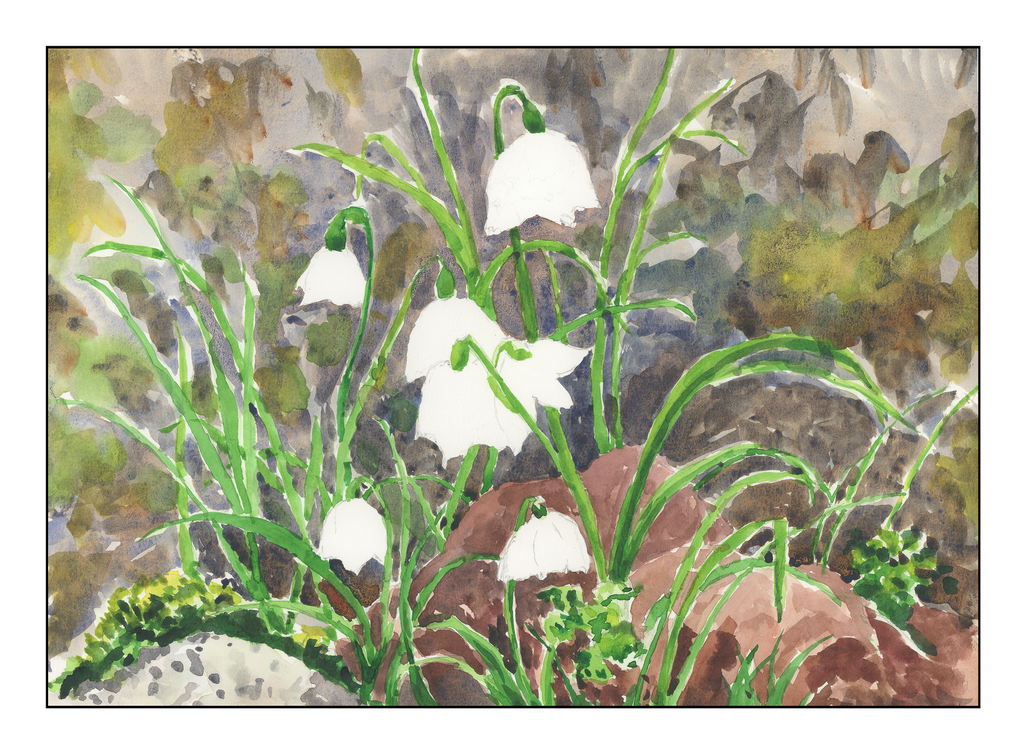
Yesterday’s painting is now revisited, this time without lines, as well as with a few stages of the painting shown before the final rendition.
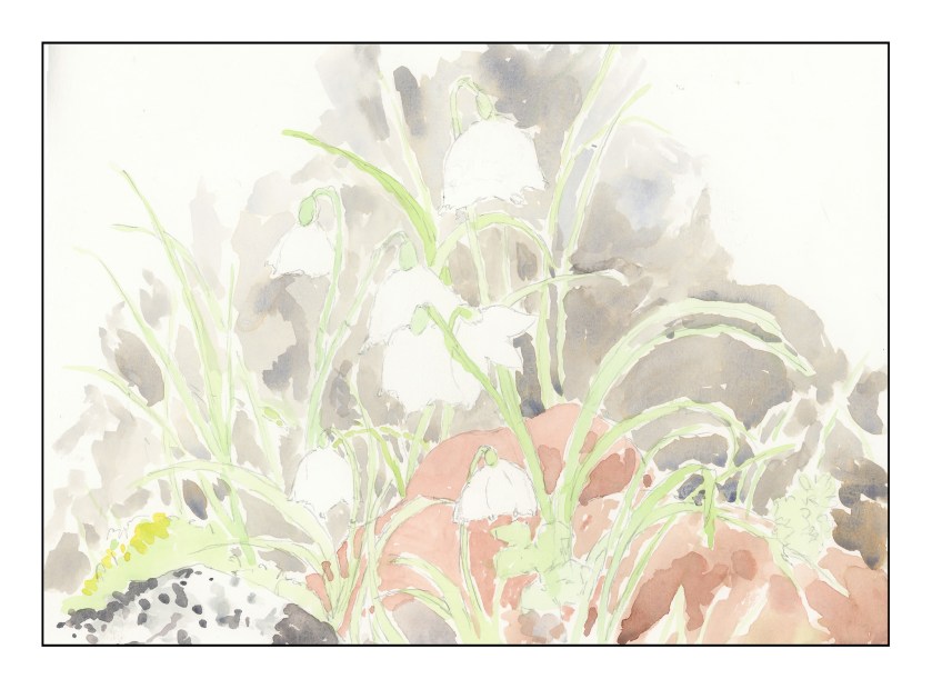
Working with white space is my biggest challenge, so I decided to lay in colors as a first step, as you can see above. The idea here was to work around the white flowers and do what I could to keep them white.

At this point, colors and values are generally in place, but the white flowers have yet to be touched. This is where the painting caused some questions. Should this be more “painterly” – that is, splashy colors – or should it become more “formal” – meaning a more graphic rendition. Because I am more inclined toward the “painterly” I went ahead and worked wet in wet, and in my mind’s eye, more messily. Splash! Splash!
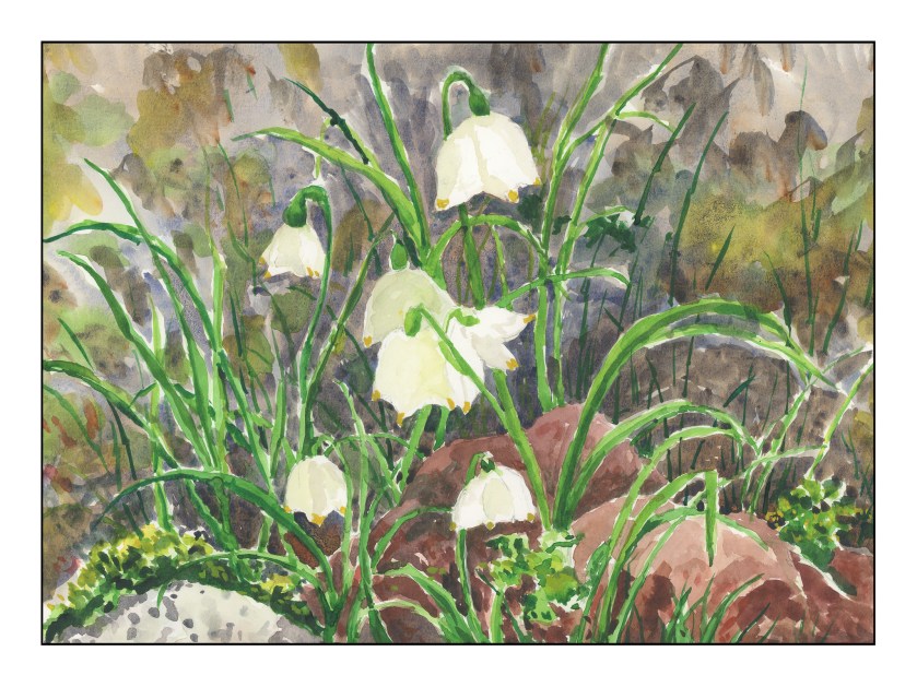
Here is the final version. I used pale colors to give the white flowers some dimension, but am not sure how successful they are. I have a few ideas of maybe a third rendition, but that is for tomorrow if I do it. At this point, I tried to introduce better contrast and detail in various areas, as well as working in some oranges, reds, yellows, and light greens throughout the painting to unite parts of it throughout.
In general, I am fairly pleased with this painting. As with (I swear) every watercolor, it has its own ideas, so of course what I wanted to produce and what I did produce are rather different! I didn’t create mud, and though I wanted to reach for the pen to make outlines and sharpen areas, I didn’t. I did consider watercolor pencil, but in the end decided to leave it as it was.
The biggest problem is that the white flowers themselves need more contrast, but today, I am not too sure how to get them to look more 3-dimensional.
Below, you can view a slide show of yesterday’s ink and watercolor version, as well as the evolution of today’s exercise.

Ink & Watercolor
 (1 of 3)")
Keeping the whites defined.
 (2 of 3)")
Greater detail, whites still untouched.
 (3 of 3)")
Final version with whites “defined” by various pale colors, as well as final overall rendering of the painting.