
Cafe Bijou

I have been taking an oil painting / acrylic painting class through the local adult school, and the current teacher is pretty good. I am only doing oils this go around – I did acrylics last class – and I am finding them far more to my liking than acrylics. Much more to offer in terms of – what? – pleasure in using. With acrylics I feel like I am in a mad dash to paint and that really is not a fun experience. With oils, you can play and take your time, and that for this impatient person is actually a pleasure after the pressures I felt with acrylics!
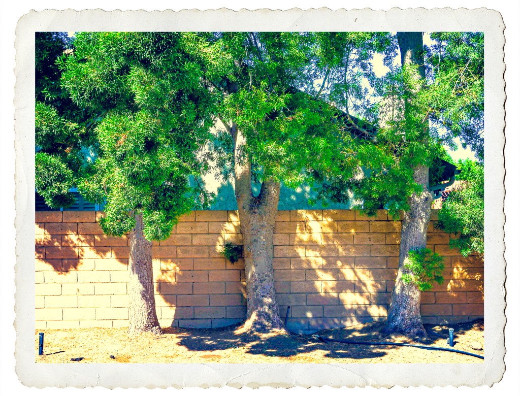
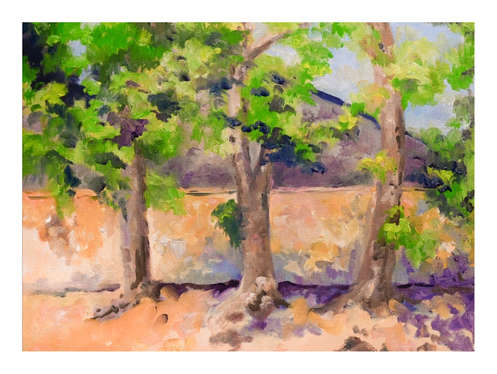
This is what my backyard looks like – hell. There is no grass and there are too many big trees. Once we get rid of 10 more 35 foot tall trees and have the back yard plowed up to be rid of tree roots, then I might be able to make it far more habitable. Nonetheless, looking for something to paint, I decided to take a photo of some of the trees against the back wall and push it in color to an extreme. By pushing the colors in LR I thought I might find new colors to use in the painting. And, it worked – I found purples and turquoises and rather icky orangish yellows.
So, I am trying to do this alla prima, but it’s not going to happen. It is happening so far in two alla prima sessions, and probably will need three or more. I am not trying to create a masterpiece. I am trying to learn how to use oils. So, this is play, and here it is, after my second alla prima session.
Next class is in a couple of days, so let’s see where it goes from here . . .

I cannot believe it has been over 3 weeks since I last posted here! Suffice it to say I have been busy with learning how to handle oil paints and some drawing, and really not in the mood to look at the computer much.
That said, today a trip down to Pasadena’s Blick store was a fun morning’s journey and got my mojo going again. I didn’t spend too much, but did pick up some colors in oil and watercolor from brands not available locally (and that is not to say we don’t have a fantastic store nearby), and just had fun wandering around a well-stocked art store. The esposo did the driving as I am not a big fan of driving in L.A., even on a Sunday morning.
Anyhoo! I am trying a more subtle approach to my watercolors – perhaps less bright, more delicate? As well, trying to convey depth better along with leading the eye of the viewer where I want to go. Not too sure if it is working, but the process is fun.
9×12, Fabriano 140# CP.
As Jane Austen wrote in Pride & Prejudice:
“I am afraid you do not like your pen. Let me mend it for you. I mend pens remarkably well.”
“Thank you – but I always mend my own.”
Austen is discussing the quill pen in particular – a pen made from the feather of a bird, usually a goose, and cut with a pen knife. The ink is most likely iron gall ink, made at home or sold in penny jars. Pre-cut quill pens could also be bought, perhaps well made or not, but certainly could be customized to one’s own liking. It is from this particular section of Pride & Prejudice that I decided I could “mend my pen” to my liking as it got worn with use.
First, let us consider what writing with a quill pen entails. It means getting a feather, preferably a long feather from a goose’s wing, a first or second pinion about 14-16 inches long. From there, the feather is aged before cutting – reportedly a year – or cured with heat, or “clarified” after soaking overnight in water that might have alum added to it. Then it is trimmed with all feathery parts are removed. The end of the feather that attached to the bird is the part which becomes the nib. It’s a complex process to learn, but easy enough once you get your mind around the steps and shape you need. As always, practice makes perfect – but even an imperfectly cut quill pen can write quite well. I speak from experience.
To cut a quill, you need to soak it in water and then heat treat it to “clarify” it – making it hard enough to handle the cutting process. This video shows you this step:
YouTube, of course, has a number of videos about it. Some are good and some are absolutely ridiculous. Here is a good one – he has already clarified his feather:
And this is basically what you do all over again when you “mend your pen”!
Why mend? Why re-trim and shape a feather quill pen? For one thing, quill pens are like anything – some you really like! I have one that fits perfectly in my hand and is a daily writer. Others are not as comfortable, some quills are narrower in diameter and less comfortable; wider in diameter and uncomfortable for lack of familiarity. All can write beautifully and I, the user, simply adapt to each one. However, quills do become a bit messy if used regularly and a good mending can refresh them. As well, quill pens require rotation – the nib becomes soggy from the ink, and need to dry out. My inkwell from the early 1800s has 4 holes in it, to hold 4 pens, so I can cycle through them (not that I do!).
When I choose to mend a pen, I follow a protocol that seems to work for me. Here are the steps.
The tools I use for making and mending my pens are a few. They include
Here is a good video about tools used to cut a quill, as well as cutting the quill itself:
You don’t need all these things – the differences of quill cutting varies, as you can see, from the above videos.
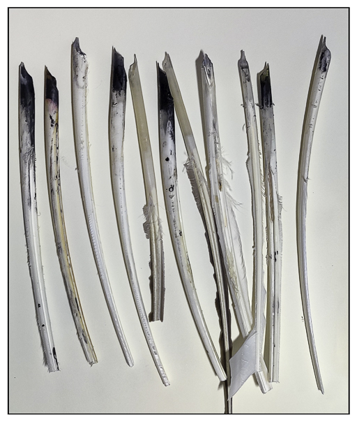
So, today I mended about 7 pens and cut 5 more, two of which were failures. I threw an old quill pen out as it was done in, and my mending attempts only made it worse. I saved my favorite pen and fixed a bunch and made some new ones. Not a bad few hours spent in the sunny patio! I now have 11 usable quills for my daily jottings.
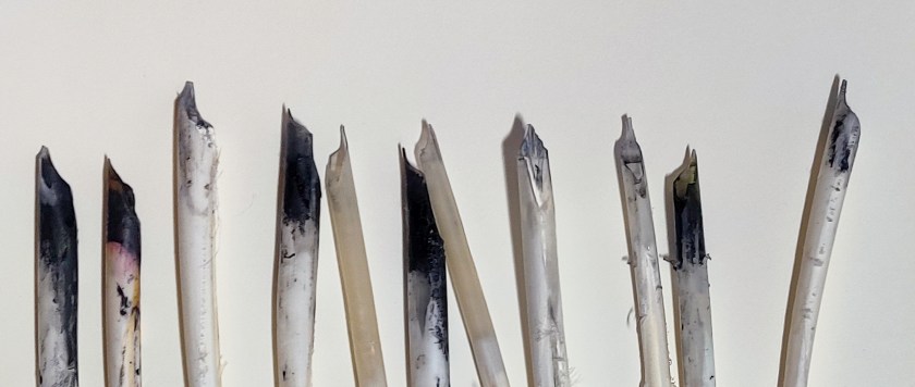
And a close up of the nibs – some are quite inky!
Hope this helps you realize that your old feather quill pen can still be used with a bit of TLC! If they did it in the Regency period, you can still do it in the 21st century.
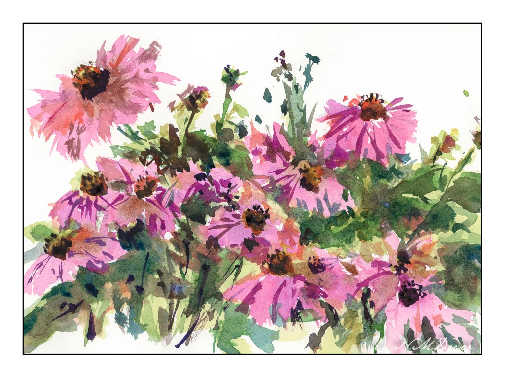
I think this is the first original flower study I am happy with. The reason is that it has the looseness of style I have been trying to get, a brightness of color, and decent contrast.
I began by wetting my paper on both sides after drawing in the basic flower shapes, some stems, and leaves. All of the pencil lines are simply guides, but it did help. From there, I did the flowers with a wet wash, more water than pigment, to suggest the basic flower petals. From there, leaves in a light yellow green with the plan to paint darker colors over petals and leaves. Once I had those general shapes in, I placed the flower center in, allowing it to bleed into the leaves and petals as it would. Then I dried it with the hair dryer.
More washes came along using more pigment and less water, but still wet. I tried to suggest leaves and shapes, painting around the flower to create indents where the petals fell over the leaves in an attempt to create some depth. Again the hair dryer, probably multiple times. Finally details with a fairly dry brush, thicker pigment slightly dampened with water. This was done for some of the stems, the flower centers, and a bit here and there.
I am using my new palette, but I don’t think I really like the alizarin crimson that much. It is the “permanent” variety and seems rather dull to my eye. I tried to liven it up with other colors, like some blue and red and orange in different areas, but it is not as vibrant a red violet I would like. I will need to do a bit of research here.
So, at last, a sense of being able to paint flowers in a manner pleasing to my sense of what a floral watercolor should look like.
9×12 CP Arches, 140 lb.
