

Author: -N-
Coffee Cups
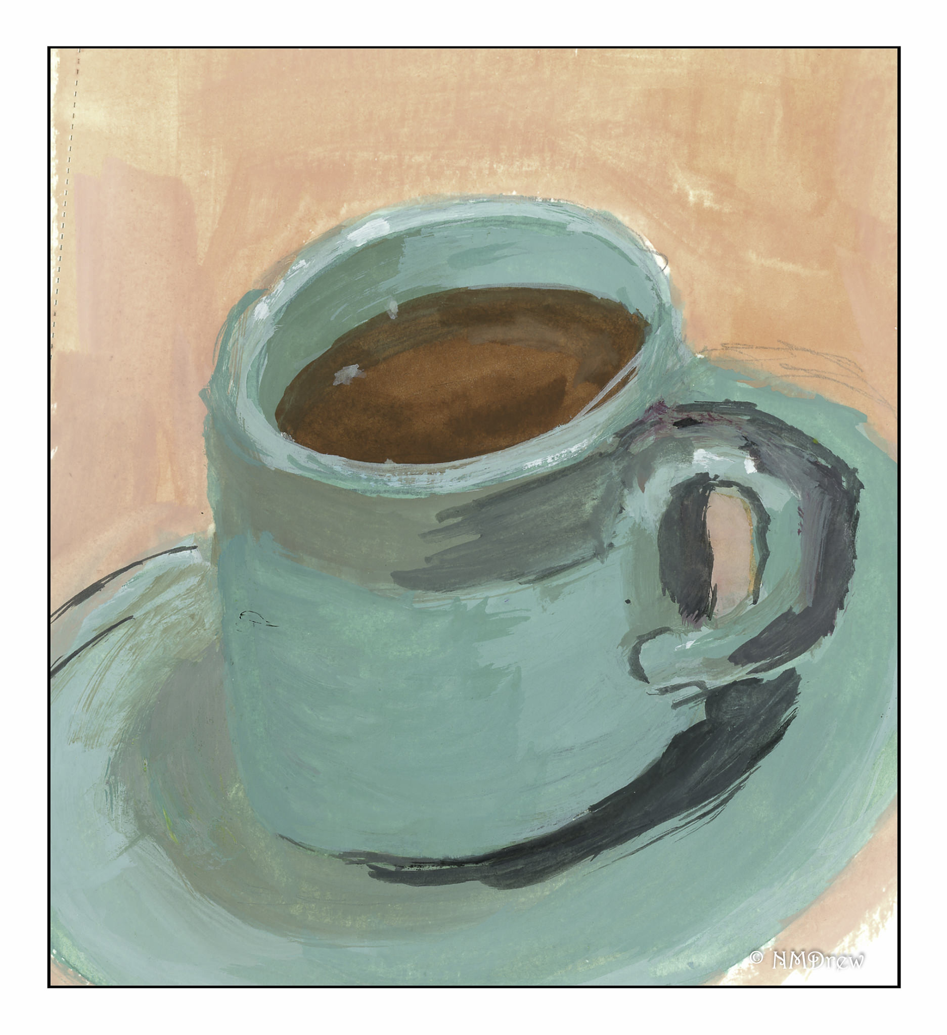
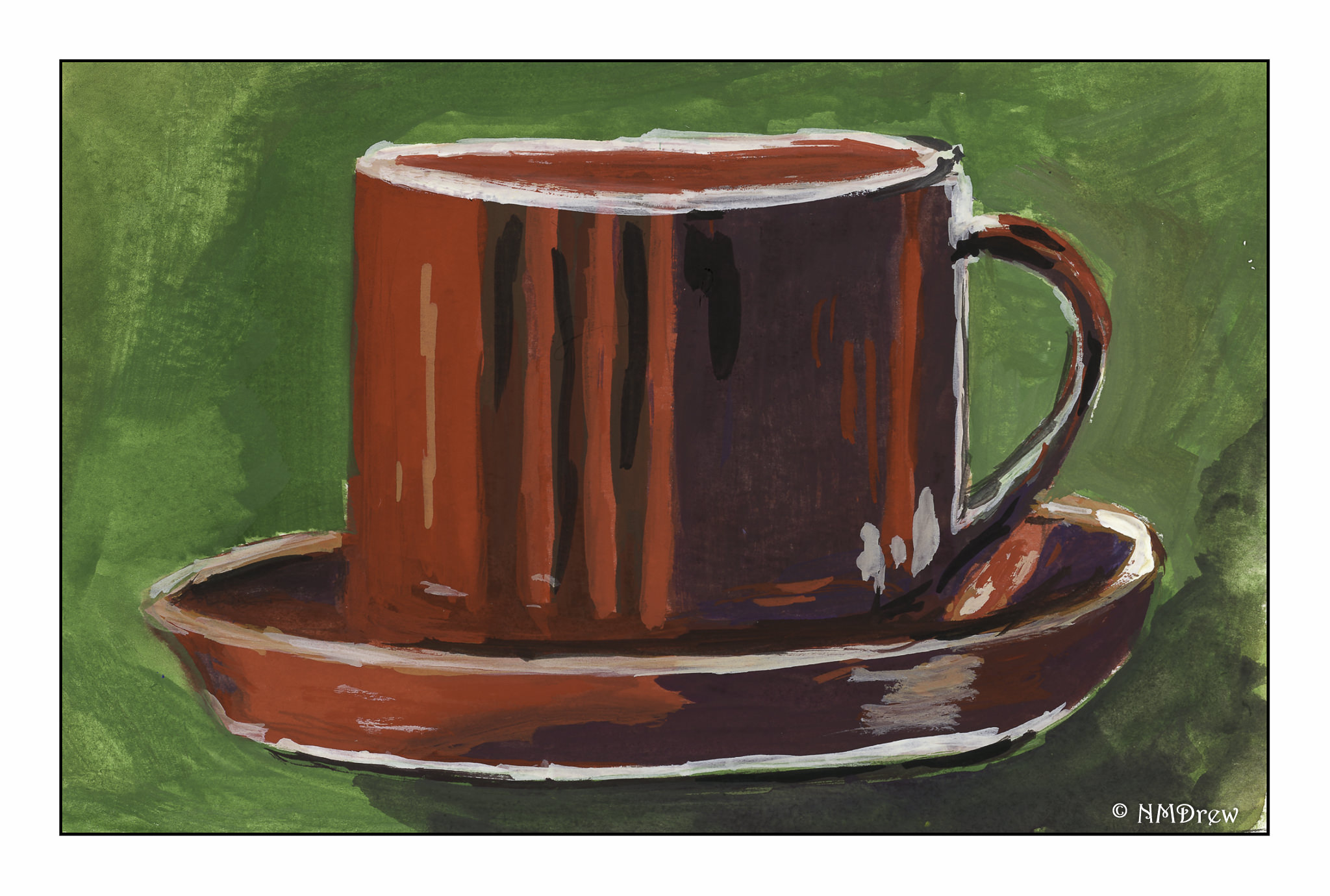
Coffee cups are simple, right? Hmm. Circles. Ellipses. Straight lines. Shadows. Reflections.
This one is tipping over!
Even with a straight-on viewpoint, the cup is lopsided.

Parts of things are easier to paint because they lack the reference points of a complete coffee cup.
In all of these, I tried to use complementary colors, either as shadows and / or background color.
-
- The first one is a green-blue, so the complement is red-orange. Adding reds and oranges to cobalt turquoise produced some interesting greys for the shadows of the first coffee cup.
- The second coffee cup is red (with some orange) so I used greens, but thought shadows looked better with some violet and deep blue added, with a smidge of black.
- The third cup is mostly a yellow color, with some medium blue for shadows. Additionally, I added purples, blues, and greens to the coffee beans in the coffee cup.
I really need to learn to draw better!
G & T
Gouache Sample Cards with Zinc White
I am not the kind of person who likes to swatch things, colors, paints, knitting, and so on. I just like to dive in and do things. To a degree, this is good as it allows me to spend time learning about something before working on the theories, if that makes sense. With painting, experiencing it first is for me a better way to understand something. Afterward I can get analytical.
Since I feel comfortable now with gouache, I made up a series of swatch cards. I took each color I have (which is far too many most likely!), painted a pure out-of-the-tube bit of color, and then, from right to left, added more white to see how the color changed. It took a bit to figure out the best way to swatch, but that is how I like to do things – just do!
Each swatch card below can be enlarged so you can see the name of the paint color and see how it responds to the addition of white.
")
I found this to be a really helpful exercise. Some colors are so different when white is added, some for the better, some for the worse, and some are just plain surprising. For instance, I love Hooker’s Green in watercolor, but am not at all enamored with it in gouache. It could be the brand, too, but it came as a surprise.
My next exercise is likely to be adding black to the colors, or choosing a complementary color. I like the idea of working with complements for greys, and while blacks will dull a color, it is not the same as making a grey. I can also try my Holbein Grey #2 as well. Today, though, enough with analysis, and on to painting!
Cucumber Flower

