Today I moved forward a few steps, in part because I’ve been busy with other things. However, I am determined to work every day on this class, to keep myself from forgetting things. There is a lot to learn, even though it may not appear to be such.
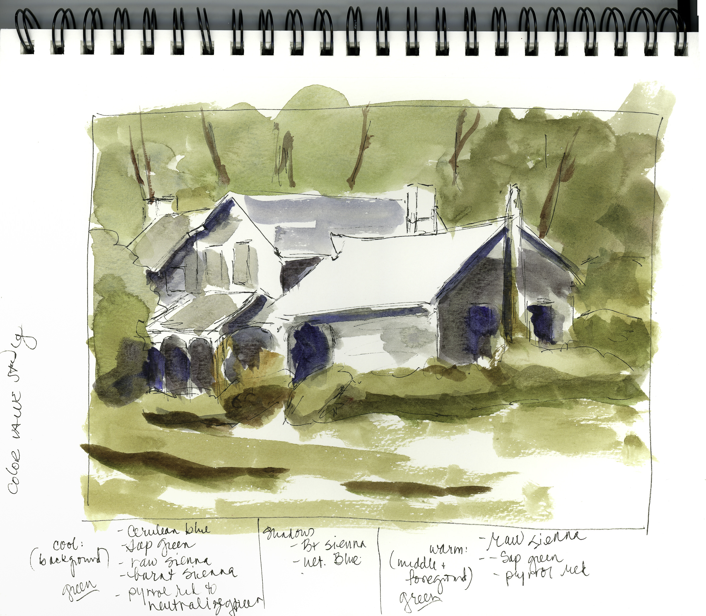
Moving from the value studies, the next step is color value studies, for light, medium and dark, but also for warm and cool greens and neutral colors. To me, this is often an issue. I don’t perceive colors as “warm” and “cool” visually – I see them intellectually, meaning I know some formulas for mixes. This section of the course, then, is very important for me – it’s a road map for future work.
Cool green are achieved by using sap green with a tinge of pyrrol red, raw sienna, burnt sienna, and (to my surprise) cerulean. In the video, Rick mixes these colors and uses them for the trees in the background, behine and beside the house. Warm greens are created with raw sienna and sap green, with a tinge of pyrrol red to neutralize the sap green. These greens are used in the foreground grasses and bushes in front of the house. I can see the differences in my color study, but they are subtle. However, painting is a skill and learning such things, and memorizing them, adds to the basic skillset of painting.
Finally, using burnt umber and ultramarine blue (supposedly a warm blue!), dark values were created. These two colors often are used in painting to replace what we may consider to be black visually. Now we have a color study with values of light, medium, and dark. These should help with the final painting when considering what to do!
Besides explaining the usage of color, Rick states he does not mix his colors on the paper, but on the palette, getting the consistency he wants before applying it to the paper. Other painters take a color directly to the paper, and then mix as they go along. Both techniques have their points. I find my colors are more pure when I take them directly to the paper, but easier to turn to mud if not carefully done. The palette method of mixing colors allows for testing swatches of colors on scrap paper.
Looking at the above study, I think I want the trees behind the house to be a bit darker (more contrast?) along with the windows on the far left, second floor, of the house.
More tomorrow!