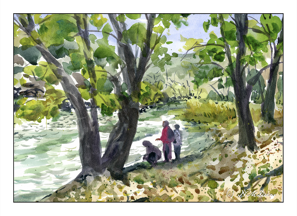
This painting is based upon a pubic domain photo by Natividad Chavez of the BLM (Bureau of Land Management) taken at the Cronan Ranch Regional Trails Park in Pilot Hill, CA. Northern California has some absolutely beautiful landscapes. As well, the BLM showcases some truly magical parts of the country, areas both easy to get to and others quite remote, requiring hours to reach.
What I liked about the scene was the curve of the water and the people standing on the river’s shore beneath the trees. While my execution of the light was not what I wanted, I am rather pleased with other parts of it. And, it has people in it!
There are some days where chaos is the daily menu and you just have to flow with it. I had an appointment in the morning so I could go to my painting class in the afternoon. Well, that appointment turned into a hurry-up-and-wait-for-a-phone-call situation. Solution? Watercolor!
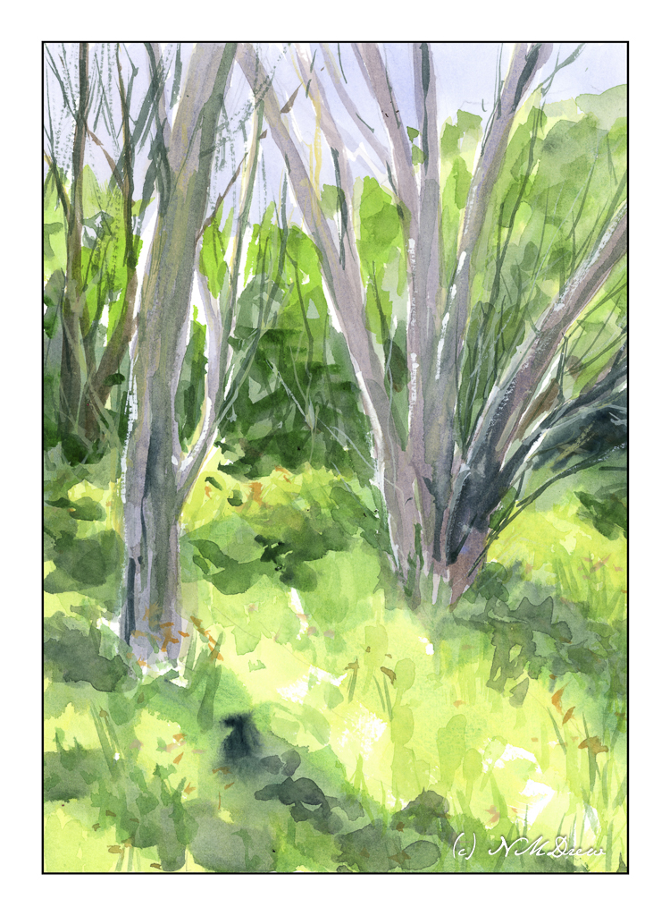
This painting is loosely based on a photograph I took while out at the settling ponds in Ventura. In California, “Spring” happens after any rainstorm. The brown grasses green, trees bud, flowers bloom. It’s the nature of the beast. We had rain yesterday and have another big storm coming in next week. In the days before my visit to the settling ponds, we had a lot of rain, and the result is this lovely little bit of trees and grass. Hard to believe this is within walking distance to the beach!
I did a bit of post in LR on the photo, but it does catch the sense of Spring, I think.
Pixabay is a wonderful source for photos for painting subjects. Resources like this allow you – the artist or whoever – to explore worlds new to you. I, for one, doubt I shall ever visit a city with yellow trams unless I travel far from my current stomping grounds. This painting is derived from one such photo.
In the afternoon of one of my classes, I had about 20 minutes left to paint. The one I was working on was done to the point I could not go any further. It still needs to be finished while I try to figure out how to do the people in it.
I laid in an essential outline and some basic colors in those remaining 20 minutes and set it aside for the next class period, which is about 2.5 hours in length. I also decided to do it alla prima – finish it all at once. And, I did. Over the past few days I worked on some refinements, but very little.
The only thing I think I want to do a bit differently is the headlamp on the tram – make the white brighter and colder. To achieve this, I probably will use a cold blue mixed with titanium white.
Yesterday’s paper – Meeden – came as a really nice surprise. I did not expect it to be as good as it was. I am skeptical about paper without a long pedigree, and even then, things can go wrong. Sizing has proven to be dicey just a few times with name-brand watercolor papers, but when it ruins a painting, it ruins its own reputation. Realistically, it does happen. Once I had a pad of paper with bad sizing not along one edge, but throughout the pad in random places and in very large areas. Ick, ick, ick. And I have never bought their paper since.
And, given the praise for Millford paper and the weird streak across my 9×12 pad that ruined the sky in a painting, part of me was very hesitant to try another pad. Luckily for Millford, and happily for me, I had a 16×20 pad (not a block) of the same paper. So, as the painting on the smaller paper had been so good despite the flaw, I decided to chance it.
Millford paper, an English paper from St. Cuthberts Mill, is based upon a now-defunct and beautiful watercolor paper, Whatman’s, which was hard-sized and thus less absorbent than other papers. Ted Kautzky (of Ways with Watercolor fame) recommended it as well as Arches. Kautzky was my first adventure into “serious” watercolors – back in my teens I found his book in the local library, bought my own copy (which I still have) and dug in. So, when I finally could get a hold of Millford in the US, I had to give it a try.
Sizing on watercolor paper basically determines how long water will stay on a paper’s surface. Less sizing, quicker absorption. Bad sizing, mottled and spotty color as the paper absorbs water and color haphazardly. Harder sizing, watercolors stay on the surface of the paper longer, permitting the painter to really work with color. And water.
If you are a fan of wet-in-wet, Millford is your best friend! This is what made me fall in love with this paper. It also made me slow down – really, really sloooooooooowww down!
I would say that most papers – Arches for example – will stay damp 10-15 minutes if you use a good bit of water. I had to get up and leave my painting, sometimes for at least an hour, because the paper still had not absorbed the paint. Usually I use a hairdryer when I want to move along, but I didn’t so I could see how long the paper would stay wet. And, as the colors sit on the surface of the paper, a hairdryer could blow the paint around and ruin the effect.
Having previously worked with the block of Millford, I knew the paper could handle abuse. I did the same here – big, wet washes, lifting of color, re-wetting the paper with a lot of water, and on and on. This painting, as a result, took a lot of time. I worked on it over the past 3 days, which is a record for me.
To learn a bit more about Millford, here is a link and another link outside of St. Cuthberts which tells a good story.
St. Cuthberts Mill, Millford watercolor paper, 16×20, CP, 140#.
I am always trying to find economical and superb 100% cotton watercolor paper. This one is really good! Fraggle said she likes Meeden paper, so off to Amazon I went and ordered this 100% cotton paper. Though advertised as 9×12 inches, it measures 12.2×8.3 inches per the cover of the block. I don’t really like blocks, but the I think the paper may be worth that irritation.
This is the paper I ordered (click to get to link). It is the weight and texture I prefer: CP, 140#. Painting on it was a pleasure. Color absorbed nicely and didn’t create any weird textures. Absorption rate was reasonable. It held up to washes and glazes on multiple levels. Working wet-in-wet was easy to do.
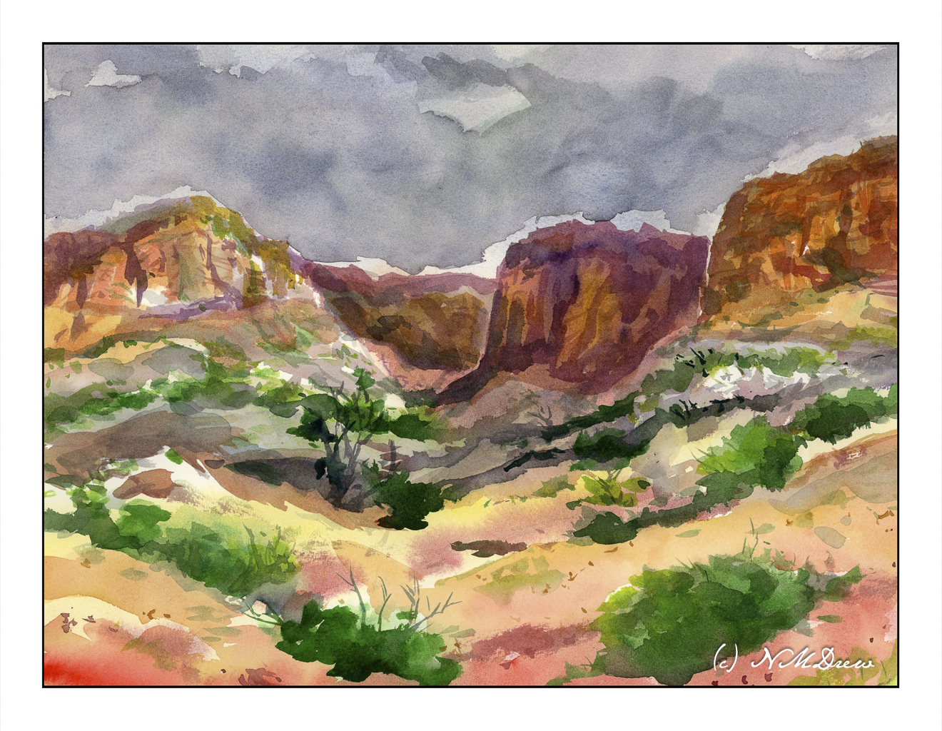
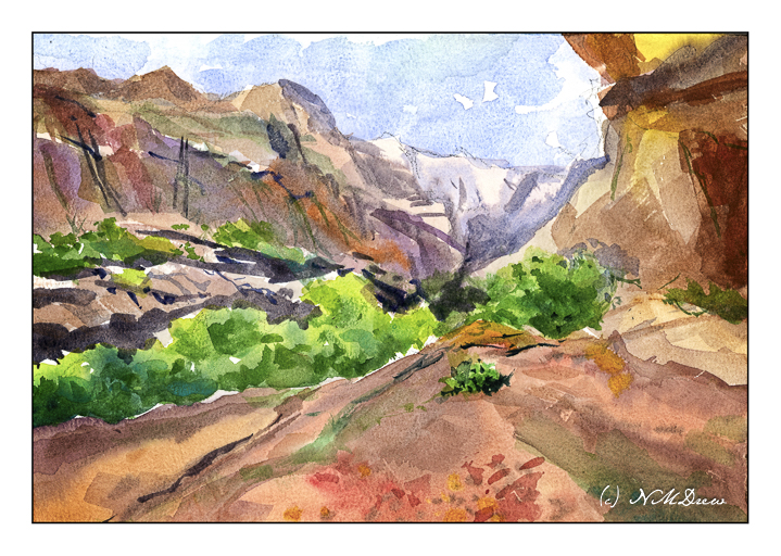
Capitol Reef National Park is located in central Utah and is characterized by red rock and sandstone. Canyons and arches are some of its characteristics. As it is desert, the vegetation is sparse and dots the landscape. It is a stunning bit of country – Utah has some of the most beautiful parks! – as well as a place with a fascinating history, from prehistoric times to modern day settlers. Definitely worth a trip!