
Living in California meant traveling across country to move. We did this when I was 12, and I did it as an adult in my 30s.
Driving through the vast reaches of this country always amazes me. First, it is just BIG. Open miles of open land, a house or ranch or roadside attraction.. Huge mountains seen across miles. Winding roads where dust behind you flies in a cloud as you bump along, looking for rocks and holes. Freeways, local highways, dusty country lanes – this is what I enjoy when I travel. This fall we plan a trip across northern Nevada and into Utah, when the weather is cooler, and perhaps we will even enjoy colored leaves at the higher altitudes.
Awhile back I loaded up one of my old cameras – a Voigtlander Bessa RF 6×9 with a Heliar lens, ca. 1935 – with Ilford Ortho 80 Plus film. I forgot about it until I opened the back of the camera and slapped it shut as quickly as possible. As the camera only gets 8 pictures per roll, I lost a few – like 3. One image was too dark for use. But, the remaining 4, while not great, were fun to manipulate in post.
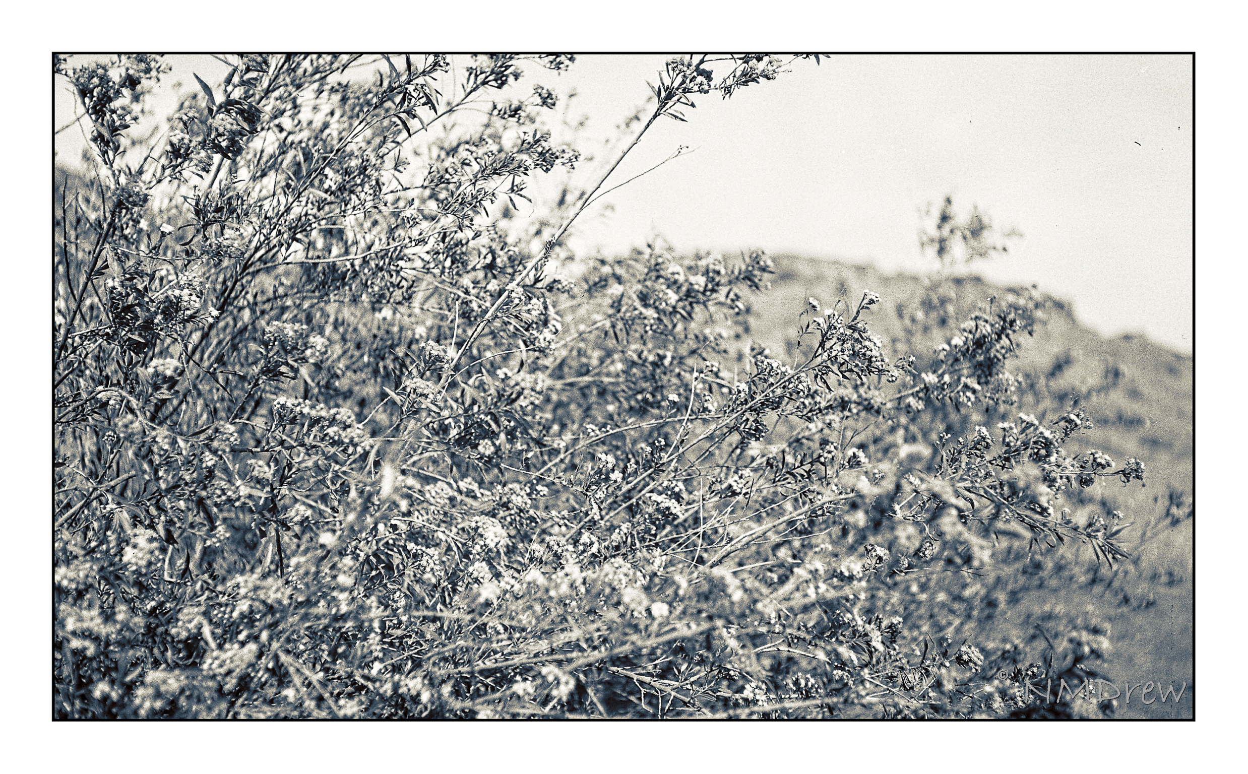
The Ilford film had just been released, so I bought a few rolls to test out. In my 35mm film camera, it worked beautifully, but my exposures were marginal in the 6×9 at best. I worked on them a lot to bring in discernible contrast – most were over-exposed. The lens on the camera is a beautiful Heliar, but my guestimates with 80 speed film were too high. As well, I used no filter since I don’t own one to use with the lens. So, above, a test shot to look at contrast – white flowers on dark green foliage. I created a preset in On1 Camera Raw that I liked; it brings out the details but doesn’t create too much contrast.
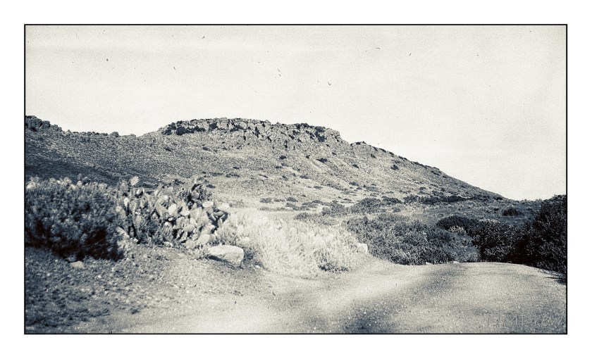
This photo makes me think of old dirt roads and stagecoaches jouncing along – like you see in 50s movies! The image got a light leak, but the details of the distant mountain – Mount Clef – and cacti are worth a look
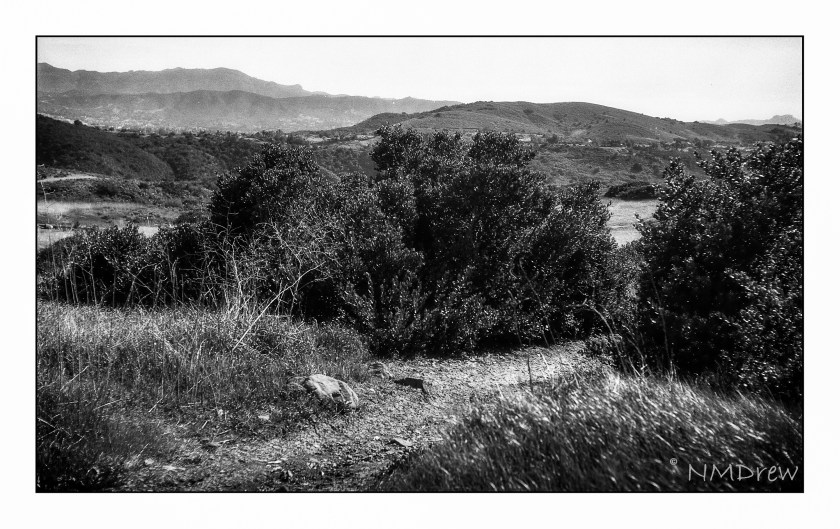
Again, more detail and a bit of LR dodge-and -burn. This is the dried landscape nearby. When the winters are wet – which ours was not this year – the grasses and mustard can grow up to 8 feet. Easy to get lost in, but don’t – stick to the paths or ticks and other critters will get you.
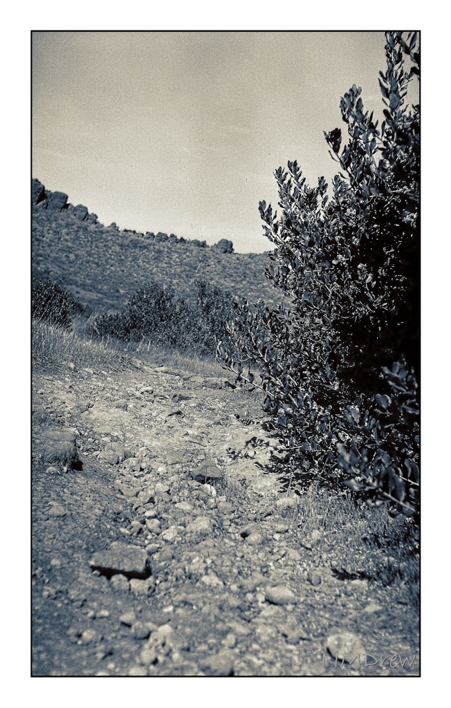
Backcountry is beautiful and dangerous. I remember turning back here – a rattler was basking in the sun. That’s another good reason to walk where you can see ahead of you!
So, a bit of my West with my old camera and newer film and technology. The Voigtlander did not let me down, nor did the film. I am looking forward to taking this camera with me up to Morro Bay next week – along with more modern cameras – and out to Nevada and Utah. More Olde West to come!


