
Waiting

We have milkweed planted throughout the yard as well as in containers. The other day – just about 3 days ago – I found a new chrysalis hanging from a flower pot. I watched it change from pale green to darker shades.
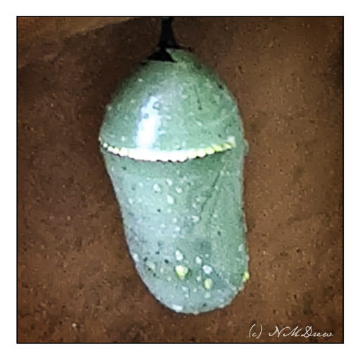
This morning, I went out to look at the chrysalis, but as I had hidden it behind some other plants, to keep it moist in the hot, dry wind, I didn’t really get a good view of it.
Then the gardener came – and blew everything everywhere. When he left, I looked, and the chrysalis was empty. I hoped the butterfly had not been blown out of its home before it could become a butterfly . . . actually, I was really upset! I was sure I had been stupid not to tell the garden to stay away from that area. I was convinced the butterfly-in-waiting was dead.
And then I bent down, and before I knew it, a monarch butterfly fluttered to the ground. It was her – definitely a her as there are no scent markings on her wings!


In time, I got her to climb onto a milkweed branch and carried her to a bigger plant. She sat there for a few hours. I took this video and some pictures. A bit after doing something in the house, I went back out. She was still on the bush – but then she flew off, over the fence and into the sky.


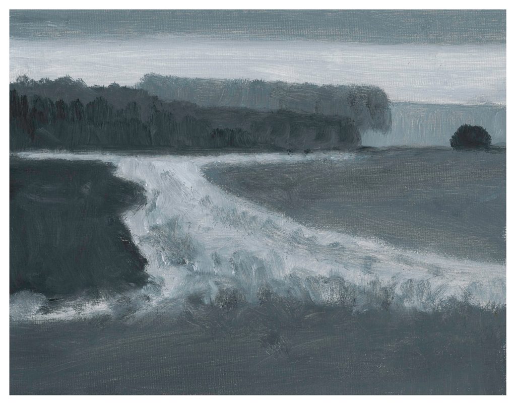
Finally! I am dee-oh-en-ee. I took the painting I thought was sorta done, talked with my teacher, and we decided to add a few more flowers. So, I did, and signed my name on the left. On the right I have my digital signature.
I really enjoyed doing this painting. It is on 12×16 Fredrix canvas pad, primed with gesso, and painted over about a 3-4 week period. It is a pleasant break from monochrome – but that is for another time. Today, let’s enjoy Spring as we go up the hill.
I asked for some criticism on this painting I did a few weeks ago. Below is the original scan.

Some opinions were that it was lacking in depth, and that the right and left sides needed to match better. So, today, finally got around to doing some modifications. Here is the new painting.

Let me know what you think. The newest scan is a bit more vibrant than the other, so keep that in mind. My class is tomorrow afternoon, so I will talk to my teacher, too.
For the past few months I have been taking a number of classes in watercolor and painting. Throw in an occasional Pencil Portraits in the Park classes, and you can see I get a bit busy.
Magpies like bright things, and I am convinced I am a magpie reincarnated. Hawaiian shirts are a particular delight. Color in any form, the brighter is usually the better, even if it borders on poor taste. Oddly, I do enjoy black and white photography – it can be quite beautiful and dramatic – but painting value studies, monochrome, has eluded me as something to enjoy – until now!
I have been taking an online class from Ian Roberts for the past few months. It began with value studies in pencils. Now we are doing value studies in paint. Some people are painting in watercolor, others in acrylic or pastels; I decided to try out oil paints for the first time in years – nay, decades – and am pleased with the results. It is a hell of a lot of fun to moosh around paint and be able to moosh it around the next day, unlike acrylics. (You can also use gouache to pretty much the same effect.) With our weekly Zoom meetings on Saturday mornings, Roberts is providing great feedback and a personal, technical, and esoteric touch to what are foundational elements in art.
Above is my first oil monochrome. I didn’t do a great job of replicating the picture, but I did get reacquainted with how to use a brush with oils. I am using hog bristle filberts if you want to know. While we are working on values, we are also working on leading the eye. Here, not a lot of success as the road or white area in the mid left is too bright – the eye is to be led to the right.
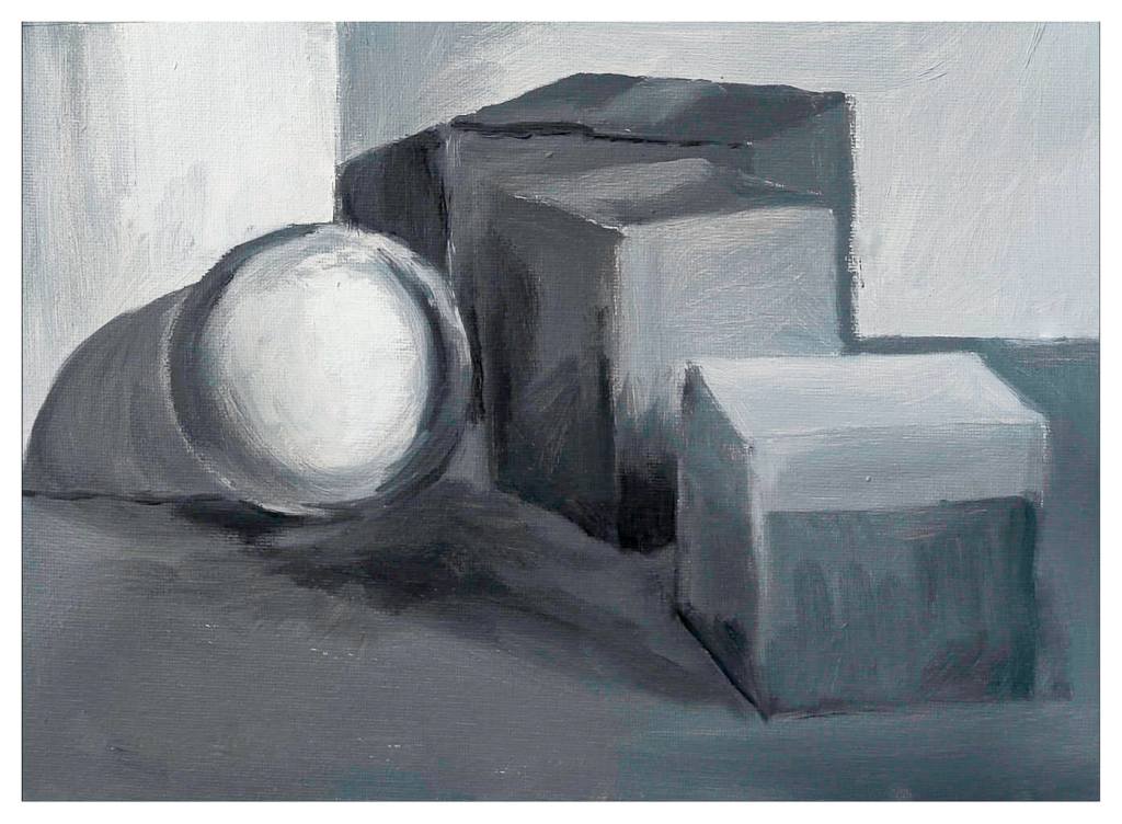
This is from the second week. Focus is on values and edges, the latter being hard or soft or vanishing. I enjoyed this a lot, even though my sphere needs a bit of anchoring! It really helped me to see a bit more sharply.
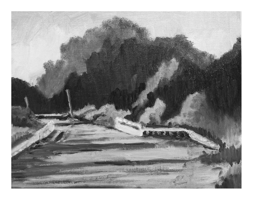
Roberts did a demo version of the still life, and then left us to find our own way with the landscape. Oils are a bit of a challenge to use because of their long drying time if you want to paint over something. As a result, I cannot scan them, but have to take a photo while they dry. Wet surfaces are a bit shiny, and the texture of the paint and canvas are more challenges to creating a digital image. This study made me see things differently, and one element I had to do was to edit the photo – simplifying it – to work a bit on the painting to make it work. Not great, but values are getting easier to produce.
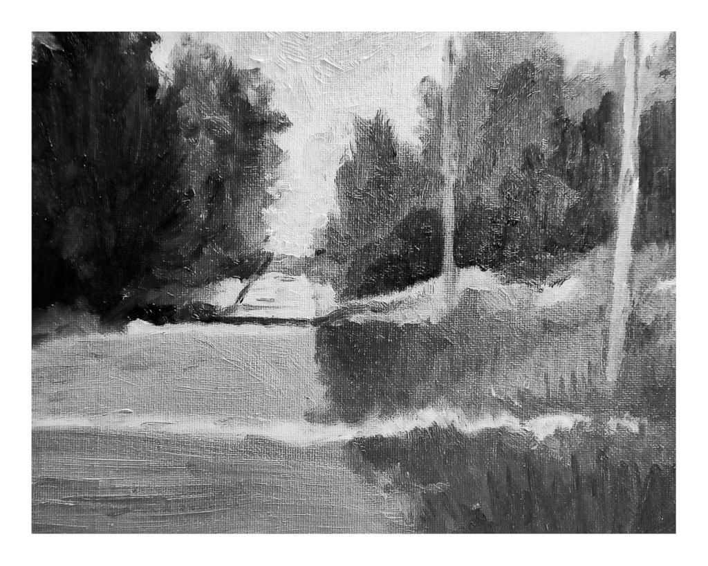
Here is one of the two studies for the third week. I did this yesterday, outdoors on the patio. I lugged out this and that, found I forgot something, ran back to get it, and it was a Big Production. But a fun one! I still need to work on this one a bit – the 2nd pole on the right needs some sharpening and the road in the distance needs a bit of work. Once more, the photo is lacking, but what can you do?
So, my painting world is suddenly black and white, and I am enjoying it. I’ve decided to do “daily painting” when possible, on other subjects as well. It will be interesting to see where all these monochrome studies take me, and when Roberts lets us to add yellow ochre to our titanium white and ivory black to learn more about warm and cool values, I think the world will change even more . . .
