
Back to “Tanglewood” – done already in gouache and watercolor and pastels. Now it is time to do it in acrylic! (If you want to see these, and the photo, click on the tag “Tanglewood”.)
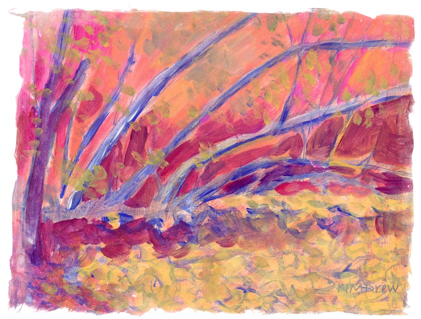
Here I decided to work on setting up values – light and dark, warm and cool. I thought it might be fun to set up areas in complementary colors, but who knows. The whole thing could end up very odd looking, certainly for me and my boring outlook and driveness to reality. I am seeing this as an adventure. The photograph itself is rather dark and murky.
Colors used on Fredrix canvas pad are cobalt blue, Naples yellow, quinacridone magenta, and zinc white. These are applied atop 2 layers of gesso and then a substrate of yellow ochre mixed with Marigold (Holbein’s cadmium orange).

Well it’s bright, I’ll give you that! Looks like you were high on LSD when you painted it 🤣 I liked the watercolour one the most, with pastels as a runner up.
Really, Fraggy! Impugning my reputation! I think it will be interesting to see how it all progresses – I like the clarity in the watercolors, but the photo has a nice murk to it. I am more inclined to brighten it up, as in the watercolor. Murk in summer is usually steamy and hot – not for me, thank you! Fetid is even better . . . or is it foetid? 🙂