Some Thoughts and Extrapolations on Black and White Photography


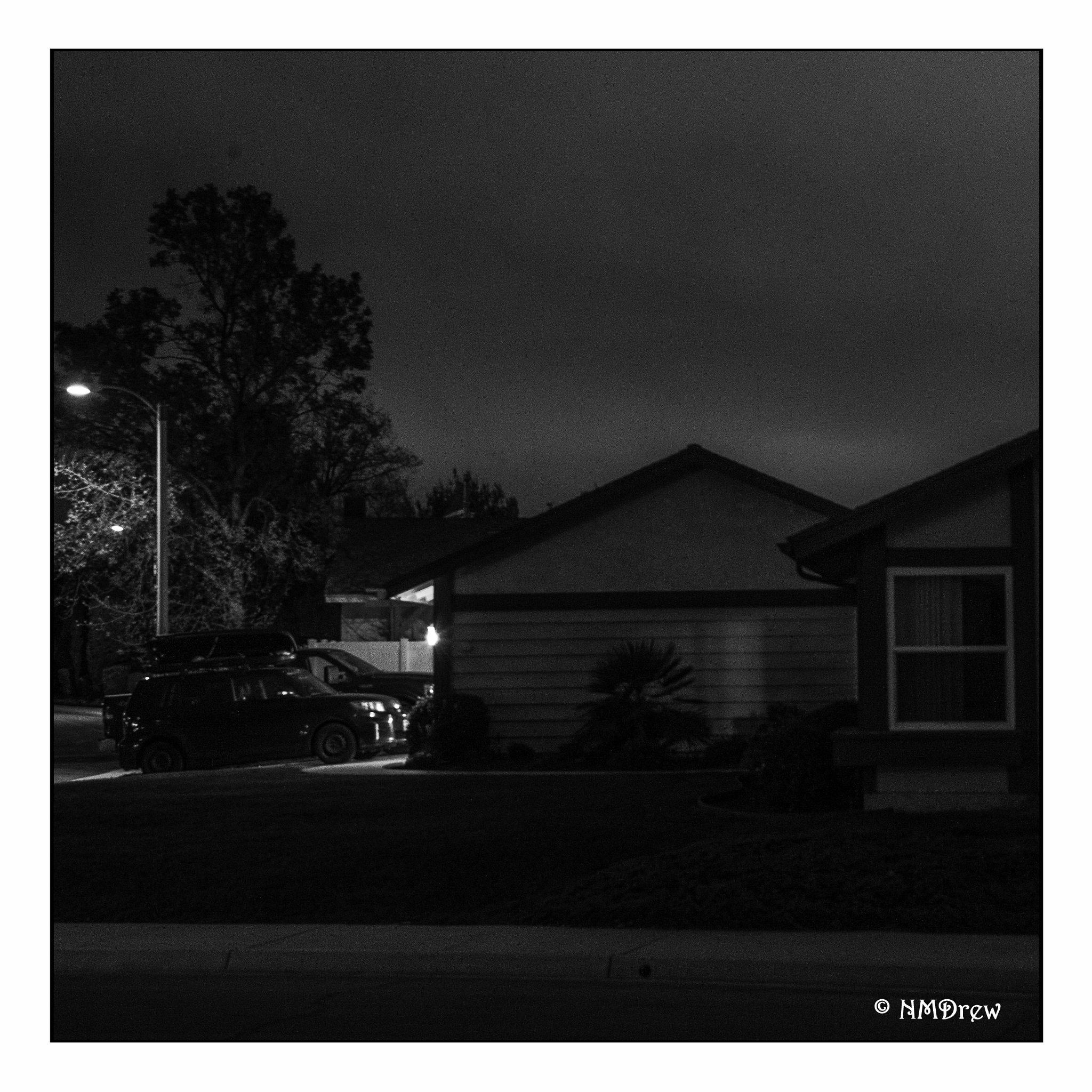
I am beginning to see why people got so excited about color photography when it became available.  While I love the drama and the graphics that black and white possess, its minimalism and aesthetics, I am suddenly feeling the lack of color in my edited photography.  Because we live in a world of color (most of us, anyway), the lack of color is a form of sensory deprivation, I think.  Our senses enrich our lives on many levels and when one sense is changed or different, our lives change and become different, and more limited.  Editing out color is getting a bit depressing!

Think about clothing and material.  200 years ago, only the rich or moderately comfortable could afford more than one or two outfits to wear.  Colors were expensive and time-consuming to produce; even naturally colored fabrics were labor intensive, but color added to that labor.  The wealthy, the aristocrats, wore amazing clothes – ones we wouldn’t even consider today as far as color and fabrics:  gold, purples, lace.  Today, our clothing is black and white and monochrome because our world today is overwhelmed by the stimulus of color – and the media – and music – and noise – and smells – and politics – and people.  Meanwhile, the natural world becomes ever more remote as land is used up and lost to disasters.  Without the natural world, we become lost.

So, black and white photography, as beautiful as it is, is a restrictive diet.  It’s like eating one thing every day for every meal.  My silent black and white project is making me a bit crazy – I like words, I love color.  On the other hand, it is forcing me to think differently – very differently – than I usually do.  Add to it the fact I now am retired and my entire day – the entire rest of my life – lies ahead of me without commitments – and it becomes overwhelming on one side, and so exciting on the other.

The word is potential.  Black and white photography is filled with it.  Suddenly, mood is becoming more important than subject matter.  How I manipulate subject matter is the focal point of the image.  Mood is, as I think of it, what I am trying to say.

This lack of color is remaking my conceptions of art and life – for the better?  for the worse?  New doors are opening as the restrictive quality of silent black and white continues.

Atmospheric Perspective, iii

This is the end of the first section of Phil Metzger’s book on perspective, which is all about atmospheric perspective.  This means, colors demonstrate depth.  Cooler colors and lighter colors recede, warmer ones move forward.  Of course, this is not a hard and fast rule, but one which is generally true.  For instance, warm colors become muted with distance and atmosphere.

As you can see from this scan, page 25 of Metzger’s book, he demonstrates this principle.  While I work in watercolor, he worked this particular study in oils.  The palette is very close to many palette choices by watercolorists.   As you can see from the study, cooler colors are in the distance, and while there are some warmer colors – namely yellows – in the mid-to-distant areas, they are muted.  Further distant mountains are paler than ones closer.  Pine trees in the distance are blue-green – atmosphere at work.  Detail is less in the distance, and greater the closer the painting is the viewer’s eye.  The same with colors – warmer to the front.

This is my quickie rendition of Metzger’s study.  My colors are similar although not the same in all instances.  To move the middle ground further away, along with the mountains, I glazed the entire area with a light blue wash; I also did this to unite the areas.  The yellows in the midground are dulled with violet as well.  The closer I got to the front of the painting, the more pure my colors became.  The oranges were sometimes straight from the tube.  The greens were mixed with yellows – that is green with yellow, green with raw sienna.  Oranges and greens were also used.  I added detail to the foreground using a rigger brush to create rock cracks and branches.  Watercolor is not oil painting, so my techniques were a bit different.

Some Thoughts

Metzger’s book continues to hold my interest.  In part it does because it is practical in its approach, beginning with color as that is what most painters “get” immediately.  From here, we will be moving on to other elements of painting.

I am enjoying the exercises and Metzger’s explanations.  There is enough detail to explain, but not so much I am bored or overwhelmed or both.

Finally, there is a freedom here – so far I am not doing horrid barns that lack perspective!  I have done a lot of those (which shall soon be posted), and am looking forward to the day that my grasp of perspective will be second nature.

The Red Barn: A Matter of Perspective

Of course, we all want our fans to tell us how talented we are and what perfect paintings we do!  Sadly, that is not reality.  In and of itself, The Red Barn is not a bad painting – I am rather pleased with it.  However, my husband is my nearest critic, and as he knows my issues of late with perspective, he pointed out, “The barn looks warped, like one side is buckling in.”

“Of course!” came my snarky reply.  “It’s old.  See?  There are holes in the barn.”  I pointed out the ones on the right, in shadow, under the eaves.

Well, I knew there was something wrong, but couldn’t pinpoint it.  This morning, I took it out for another look, and just with casual measurement between my fingertips, I found the problem.  The right front edge of the roof is shorter than the left edge.  The same applies to the right and left sides of the front of the barn.  Given the perspective of the painting, it is totally illogical!

This was truly a breakthrough moment.  I thought I had done the perspective correctly – in many ways I have, as with the road, and such, but the building itself was the problem.  I plan to re-do this painting today, working specifically on the barn roof and walls.  Hopefully success will follow!

Stay tooned (as my friend Fraggy likes to say!).