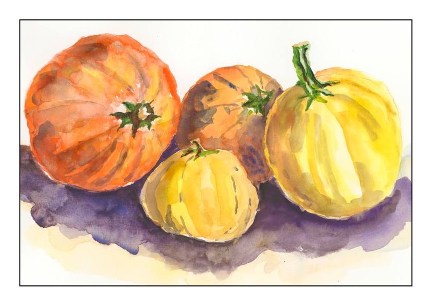
Yesterday I decided to put together my own travel palette of watercolors. These pumpkins are an experiment to see how certain colors work together. I had to choose from a ton of colors, and narrow it down to 18. Here I am using Quin Gold, Hansa Yellow, Perinone Orange, Carbazole Violet, Cobalt Blue, Sap Green, Green Gold, and Hooker’s Green. It’s really hard to choose colors as well as how to arrange them!


Such lovely hues in those pumpkins. A very nice composition -N-. Great colors for your travel palette, especially this time of year. The only orange I have is winsor orange. I usually mix to get orange but one of the colors Anna Mason suggested to have was this one, so I bought it. Its a bright orange that gets mixed with other colors anyway. I am not brave enough to paint from real life yet, so you get loads of admiration and applause from me for your lovely work. Maggie
Thanks! The fact is, it is from looking at lots of different pumpkins, just to see their shades of orange and yellow. Photos, the pumpkins at the grocery store, imagination. I expect Winsor Orange will prove to be a good color to have on your palette – go play with it. Check out Pixabay for royalty-free, public domain pictures for subjects of all kind. Thanks for your kind words and support!
You have the artists eye looking at colors wherever you go! I never heard of Pixabay but thanks for a great idea. I will definitely check it out. I should do a gourd or pumpkin since it is the season. I’m just not drawn to orange but you are right, since I have it I should play with it! 🙏😊
My nephew loves orange. His bedroom is pumpkin orange. That is a bit too much for me, but bright orange pumpkins are fun. And orange mixes well with a lot of colors. Go splash some paint!
Splashing commences! 😊🎃
Yay!